Mapoint emerged from a common civic issue: municipal reporting platforms often fail due to high friction, poor user engagement, and complex submission forms.
My work covered the full end-to-end UX/UI process: exploratory user research, gamification framework design, information architecture, wireframing, high-fidelity interactive prototyping, and usability testing for field reporting scenarios.
Mapoint nació de un problema cívico habitual: las plataformas municipales de reporte suelen fallar por su alta fricción, la baja participación de los usuarios y unos formularios de envío complejos.
Mi trabajo cubrió el proceso UX/UI completo, de principio a fin: investigación exploratoria con usuarios, diseño del marco de gamificación, arquitectura de información, wireframes, prototipado interactivo de alta fidelidad y tests de usabilidad para escenarios de reporte en la calle.
The challengeEl reto
Driving continuous civic engagement by turning urban defect reporting into a frictionless, location-based, and gamified mobile experience.
Mantener el compromiso cívico en el tiempo convirtiendo el reporte de desperfectos urbanos en una experiencia móvil fluida, basada en la ubicación y gamificada.
Exploratory user research
Investigación exploratoria
Gamification framework
Marco de gamificación
Information architecture
Arquitectura de información
Wireframes
Wireframes
High-fidelity prototype
Prototipo de alta fidelidad
Usability testing · 8 sessions
Tests de usabilidad · 8 sesiones
02
From research to prototype
De la investigación al prototipo
I structured the Mapoint project into four iterative phases, validating core mechanics with users to ensure a seamless capture-and-reward flow.
Estructuré el proyecto Mapoint en cuatro fases iterativas y validé las mecánicas clave con usuarios para asegurar un flujo fluido de captura y recompensa.
01
Research
Investigación
Competitive benchmarking of civic tech apps and qualitative interviews with 6 users to identify engagement drop-off patterns and motivations behind crowdsourced data collection.
Análisis competitivo de apps de civic tech y entrevistas cualitativas con 6 usuarios para identificar patrones de abandono y las motivaciones detrás de la recogida colaborativa de datos.
02
Architecture
Arquitectura
Defining geo-fenced notification triggers, user journeys, category taxonomies, and a balanced gamification system (point distribution based on defect severity and volume).
Definición de disparadores de notificación por geovalla, recorridos de usuario, taxonomías de categorías y un sistema de gamificación equilibrado (reparto de puntos según la gravedad y el volumen de los desperfectos).
03
Prototyping
Prototipado
Evolving low-fidelity wireframes into an interactive Figma prototype featuring a camera-first reporting interface, interactive map views, and real-time reward dashboards.
Wireframes de baja fidelidad que evolucionaron hasta un prototipo interactivo en Figma, con una interfaz de reporte centrada en la cámara, vistas de mapa interactivas y paneles de recompensas en tiempo real.
04
Testing
Testeo
8 field-simulated usability testing sessions to evaluate task completion rates, camera submission friction, and the clarity of the point allocation system.
8 sesiones de test de usabilidad con simulación de campo para evaluar las tasas de finalización de tareas, la fricción al enviar con la cámara y la claridad del sistema de reparto de puntos.
2weekssemanas
4phasesfases
6user interviewsentrevistas a usuarios
8usability sessionssesiones de usabilidad
03
Design system
Sistema de diseño
A clear, civic look: one strong blue on a cool white, one typeface, and three category colours that mean the same thing on the map, in lists and on chips.
Un aspecto claro y cívico: un azul intenso sobre un blanco frío, una sola tipografía y tres colores de categoría que significan lo mismo en el mapa, en las listas y en las etiquetas.
Colour
Color
One blue carries the brand and every action. A cool off-white keeps the screens light, and text uses three tints of near-black.
Un azul lleva la marca y todas las acciones. Un blanco frío mantiene las pantallas ligeras y el texto usa tres tonos de casi negro.
Aa
Mapoint blue#00779CPrimary. Main button, active tab, links, the hero card and accessibility pins.Principal. Botón principal, pestaña activa, enlaces, tarjeta destacada y pines de accesibilidad.
Aa
Deep blue#005F80Darker blue for avatar initials and the hero gradient, which ends at #005075.Azul más oscuro para las iniciales de avatar y el degradado de la tarjeta, que termina en #005075.
Aa
Tint#E8F2F8Soft fills. Its line, #C9DFE9, borders highlighted cards and the search field.Rellenos suaves. Su línea, #C9DFE9, bordea las tarjetas destacadas y el buscador.
Aa
Background#F6F8FAApp background. Cards sit on it in white.Fondo de la app. Las tarjetas se apoyan en él en blanco.
Ink#14181DPrimary textTexto principal
Mute#5B6571Secondary textTexto secundario
Soft#7D8893Captions and placeholdersPies y textos de ayuda
Line#E1E7ECHairlines and card bordersLíneas finas y bordes
White#FFFFFFCards, sheets and the mapTarjetas, hojas y el mapa
✓16.7:1 Ink · Background
✓5.6:1 Mute · Background
✓5.1:1 White · Mapoint blue
✓4.8:1 Mapoint blue · Background
✓7.1:1 White · Deep blue
!3.4:1 Soft · Background
✓ meets WCAG AA for text (4.5:1). ! is below it: Soft is only used for the smallest captions and placeholders.
✓ cumple WCAG AA para texto (4,5:1). ! queda por debajo: Soft solo se usa en los pies y textos de ayuda más pequeños.
Categories and pins
Categorías y pines
Blue, green and amber tell the three kinds of point apart. The same colour is used for the pin on the map and for the chip in lists, so a pin says what it is before you tap it.
Azul, verde y ámbar distinguen los tres tipos de punto. El mismo color se usa en el pin del mapa y en la etiqueta de las listas, así que un pin dice lo que es antes de tocarlo.
Accessibilitat#00779Consobre#E3F0F6 · 4.4:1
Mobilitat#1D7F55onsobre#E2F2EA · 4.3:1
Biodiversitat#A86400onsobre#FDF0DC · 4.2:1
#00779C#1D8A5C#C77907#B0090C
Pins on the map. Red is kept for high severity.Pines del mapa. El rojo se reserva para la gravedad alta.
The chip text sits just under AA (4.2 to 4.4:1). It is on the list of next steps.
El texto de las etiquetas queda justo por debajo de AA (4,2 a 4,4:1). Está en la lista de próximos pasos.
Point status
Estado del punto
Every point you add moves through three states, shown as a small chip in your contributions and on the map.
Cada punto que añades pasa por tres estados, que se muestran como una pequeña etiqueta en tus contribuciones y en el mapa.
Validat#17704Aonsobre#E3F0F6 · 5.2:1Reviewed by the community.Revisado por la comunidad.
En revisió#9A5B00onsobre#FDF0DC · 4.8:1Waiting to be checked.A la espera de revisión.
Arxivat#4F5964onsobre#E9ECEF · 6.0:1Closed and kept in the history.Cerrado y guardado en el historial.
Typography
Tipografía
Roboto throughout. Hierarchy comes from size and weight, never from a second typeface. Sample text is in Catalan, as in the screens.
Roboto en toda la app. La jerarquía viene del tamaño y el peso, nunca de una segunda tipografía. Los textos de ejemplo están en catalán, como en las pantallas.
Aa
Roboto
Regular 400Medium 500Bold 700
Big number58 / 700
Cifra grande58 / 700
12.487
Splash title32 / 700
Título de bienvenida32 / 700
Mapoint
Name22 / 500
Nombre22 / 500
Marta Vidal
Section title18 / 500
Título de sección18 / 500
Mapes actius
Card title16 / 500
Título de tarjeta16 / 500
Accessibilitat a l'Eixample
Body14 / 400
Texto14 / 400
Barcelona · Eixample Esquerre
Caption12 / 500
Pie12 / 500
Comunitat Mapoint
Shape and spacing
Forma y espaciado
The bigger the container, the rounder the corner. Screens are 402 px wide with a 20 px side margin.
Cuanto más grande el contenedor, más redondeada la esquina. Las pantallas miden 402 px de ancho con un margen lateral de 20 px.
Corner radius
Radio de esquina
26Bottom sheetHoja inferior22Hero cardTarjeta destacada18Summary cardTarjeta resumen16Cards and rowsTarjetas y filas12Search fieldBuscador6ChipsEtiquetasPillButton, filtersPíldoraBotón, filtros
Spacing
Espaciado
20Screen side marginMargen lateral de pantalla
16Card paddingRelleno de tarjeta
12Gap between itemsEspacio entre elementos
8Inner gapEspacio interior
Components
Componentes
These are live HTML, built from the same values as the app.
Son HTML real, construido con los mismos valores que la app.
Filter chips
Filtros
Tots · 3AccessibilitatMobilitat
Pill-shaped filters on the Maps list. Blue when selected, white with a line when not.
Filtros en forma de píldora en la lista de Mapas. Azul al seleccionar, blanco con línea si no.
Map card
Tarjeta de mapa
Accessibilitat a l'EixampleBarcelona · Eixample EsquerreAccessibilitat
A map thumbnail first, then the name, the place and the category.
Primero una miniatura del mapa y luego el nombre, el lugar y la categoría.
Hero number
Cifra destacada
Comunitat Mapoint12.487Punts mapats aquesta setmana
The community’s weekly total on the blue gradient. It is the first thing on Home.
El total semanal de la comunidad sobre el degradado azul. Es lo primero que se ve en Inicio.
Main button
Botón principal
Penja un punt aquí
One full-width pill for the one thing the app is for: adding a point.
Una píldora de ancho completo para lo único para lo que sirve la app: añadir un punto.
Tab bar
Barra de pestañas
IniciMapesCompletatsJo
Four tabs. The active one turns blue and bold.
Cuatro pestañas. La activa pasa a azul y negrita.
Design principles
Principios de diseño
One blue for actionUn azul para actuarMapoint blue is for what you can do: the main button, the active tab and links. Content is told apart by category colour instead.El azul de Mapoint es para lo que puedes hacer: el botón principal, la pestaña activa y los enlaces. El contenido se distingue por el color de categoría.
Colour means one thingCada color significa una cosaBlue, green and amber always mean accessibility, mobility and green space, on pins, chips and charts alike.Azul, verde y ámbar significan siempre accesibilidad, movilidad y espacio verde, tanto en pines como en etiquetas y gráficos.
Low frictionPoca fricciónThe point is placed where you are, category and severity start with defaults, and the photo and note are optional.El punto se coloca donde estás, la categoría y la gravedad parten de valores por defecto, y la foto y la nota son opcionales.
04
Key screens
Pantallas clave
A gamified civic tech platform that leverages location-based triggers, instant camera logging, and dynamic point rewards to transform urban maintenance into an engaging community experience.
Una plataforma de civic tech gamificada que aprovecha los disparadores por ubicación, el registro instantáneo con la cámara y las recompensas dinámicas por puntos para convertir el mantenimiento urbano en una experiencia comunitaria atractiva.
Splash
Bienvenida
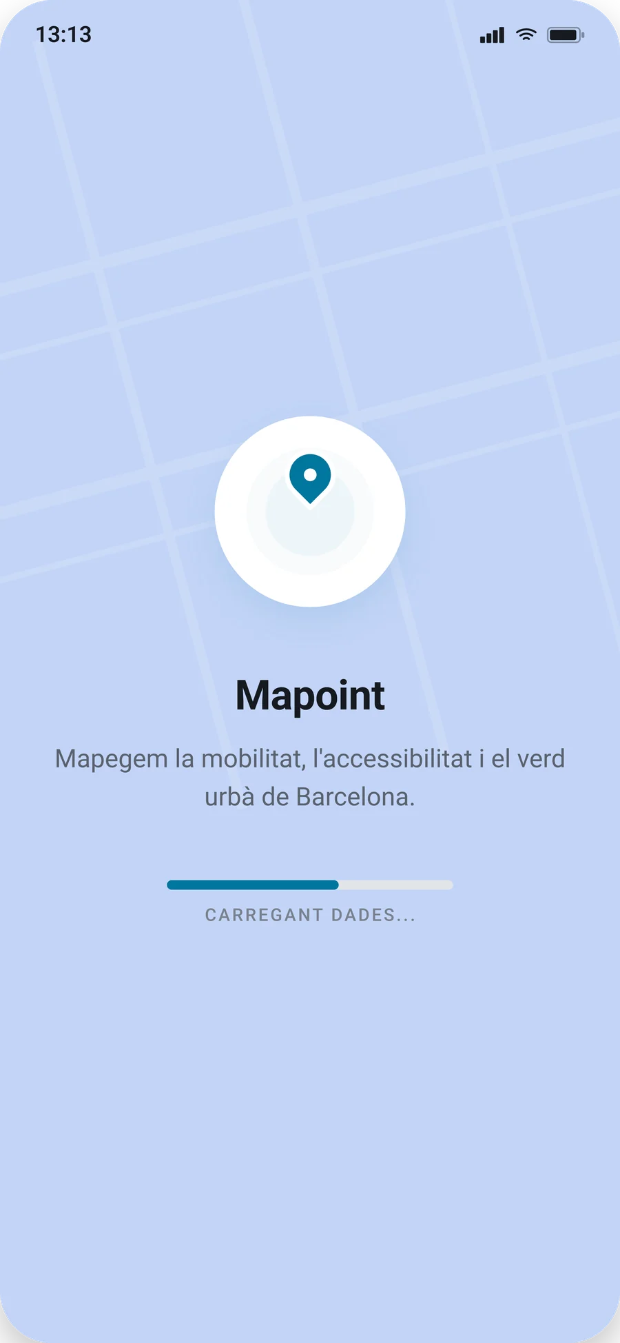
A quiet start: the pin, the name, a one-line promise and a loading bar while the data comes in.
Un arranque tranquilo: el pin, el nombre, una promesa en una línea y una barra de carga mientras llegan los datos.
Home
Inicio
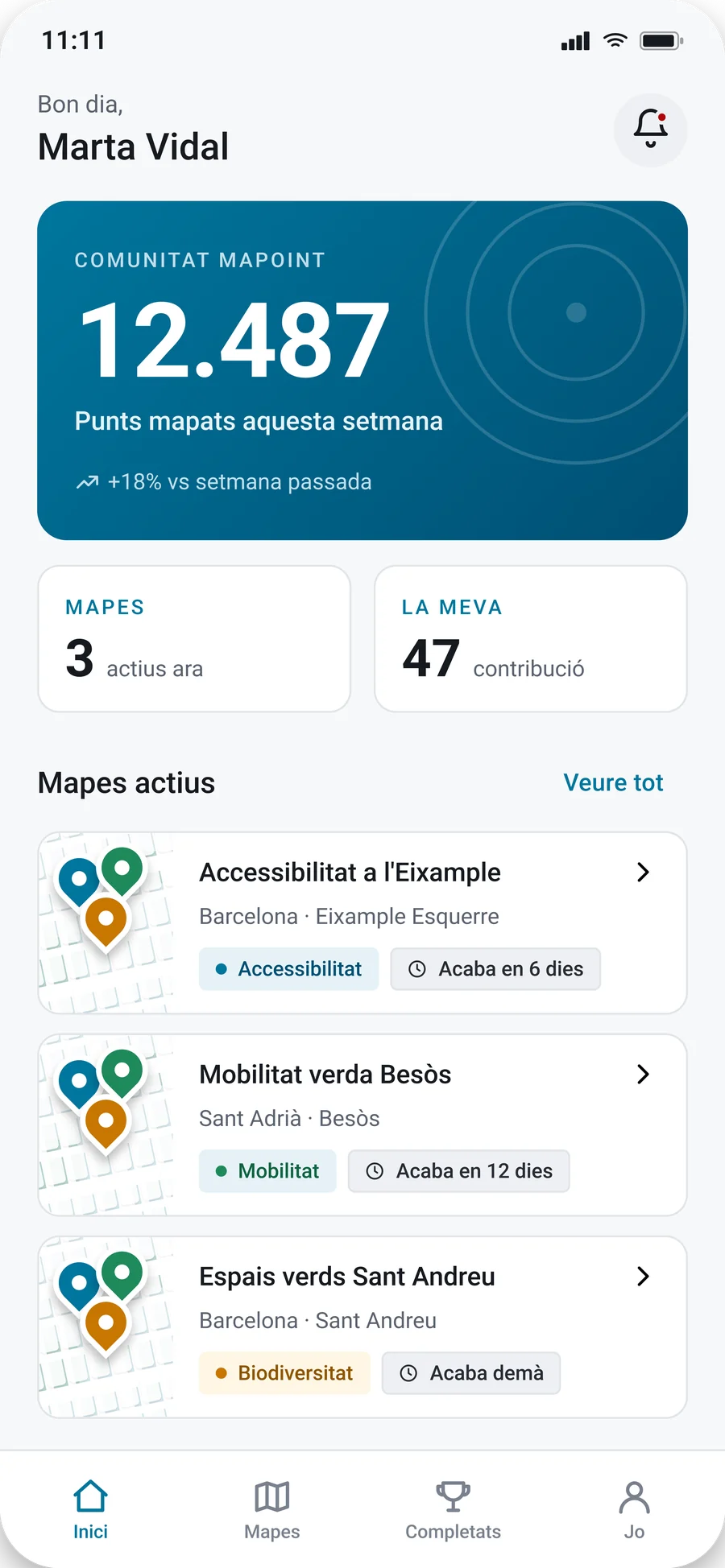
The community at a glance: this week’s total, how many maps are active, your own contributions and the maps to join.
La comunidad de un vistazo: el total de la semana, cuántos mapas hay activos, tus contribuciones y los mapas a los que unirte.
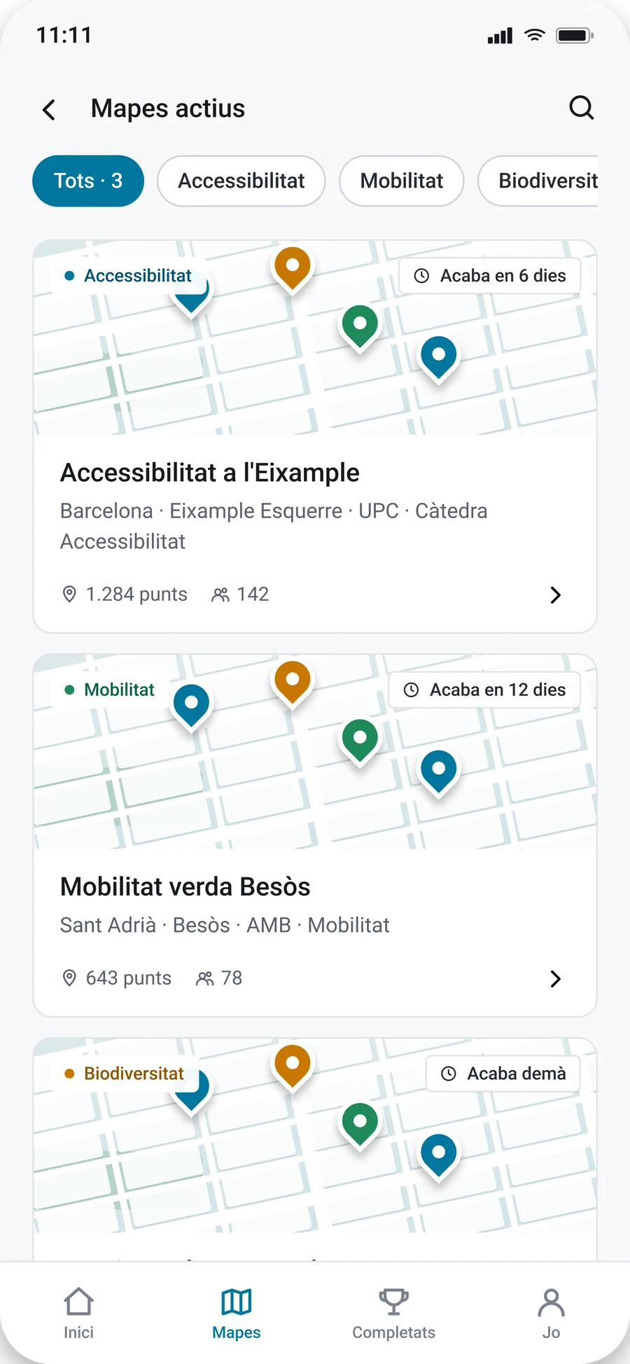
Active maps
Mapas activos
Every open map with its category, how long is left and how many points and people it has. Filter by category or by what is near you.
Todos los mapas abiertos con su categoría, el tiempo que queda y cuántos puntos y personas tienen. Filtra por categoría o por lo que tienes cerca.
Map
Mapa
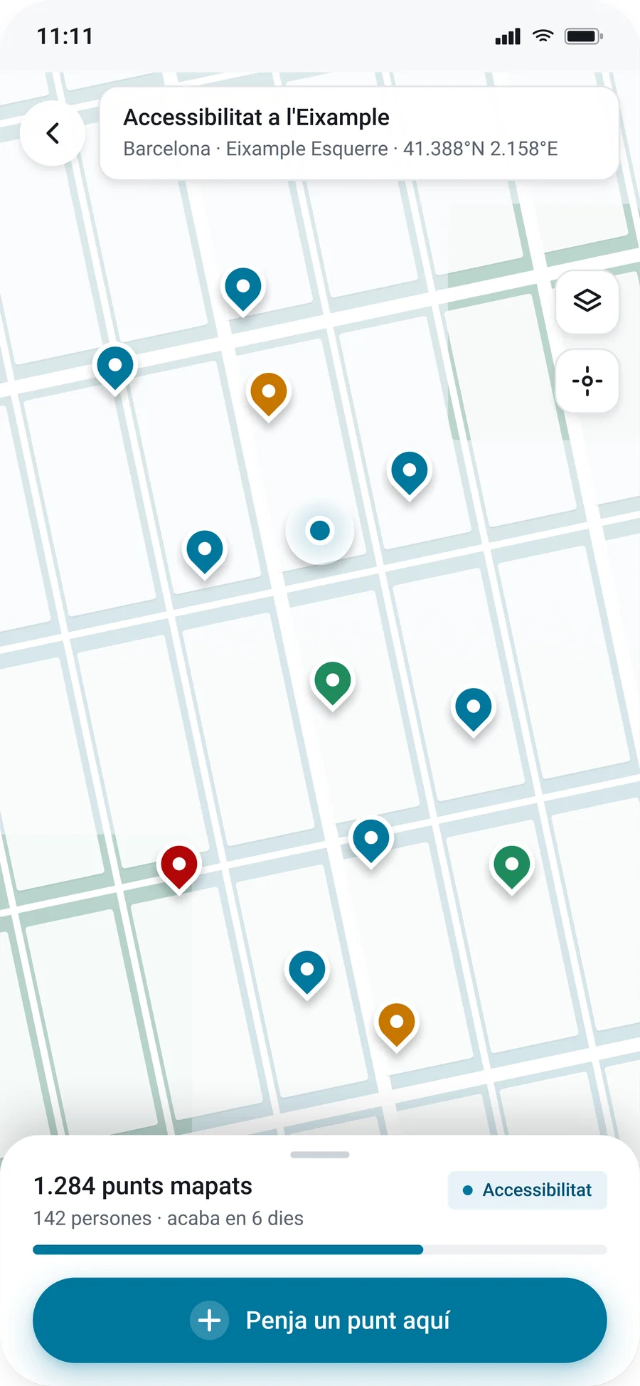
The map itself: pins coloured by category, a panel with the map’s progress and one big button to add a point right where you are.
El mapa en sí: pines de color por categoría, un panel con el progreso del mapa y un botón grande para añadir un punto justo donde estás.
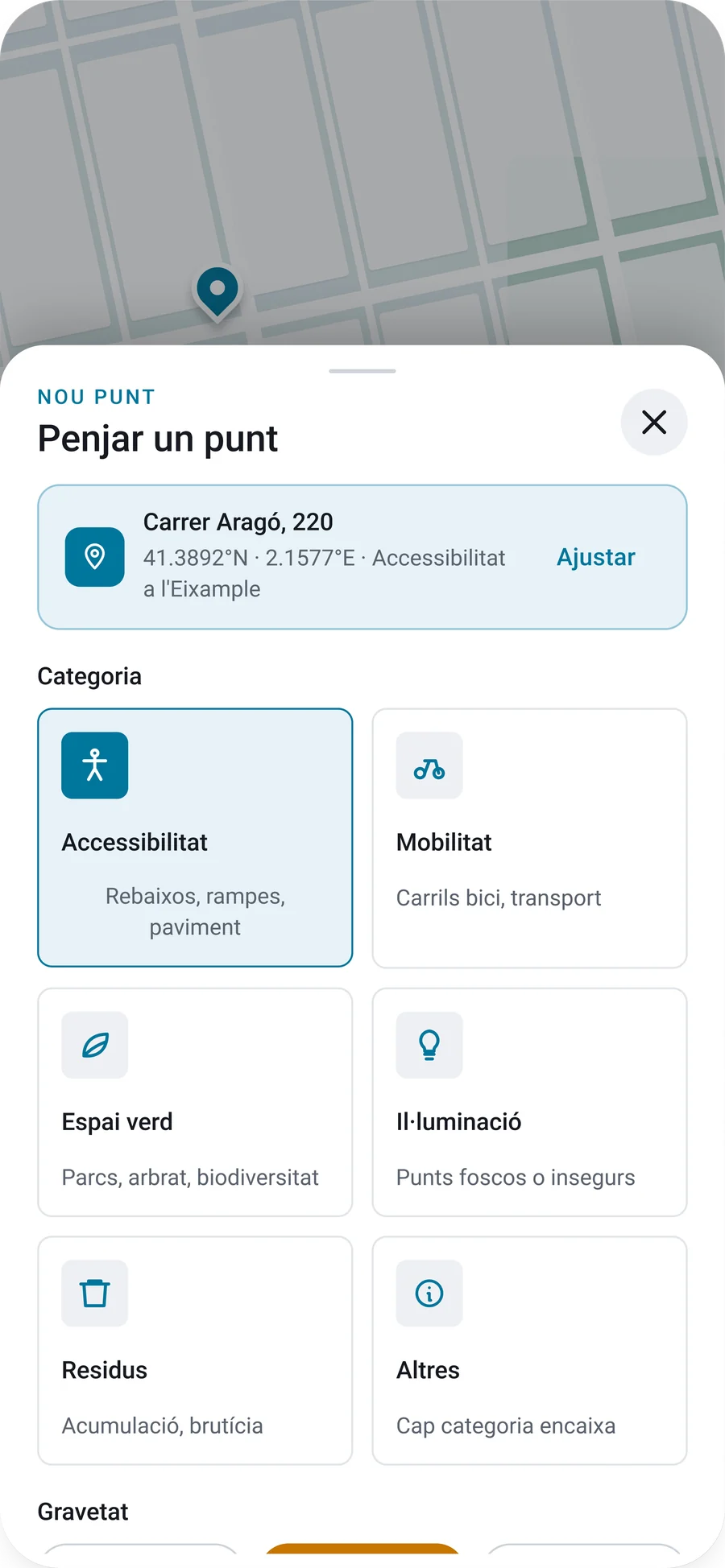
Add a point
Añadir un punto
A bottom sheet with the address already filled in, a category, a severity, and an optional photo and description.
Una hoja inferior con la dirección ya rellena, una categoría, una gravedad, y una foto y una descripción opcionales.
Completed
Completados
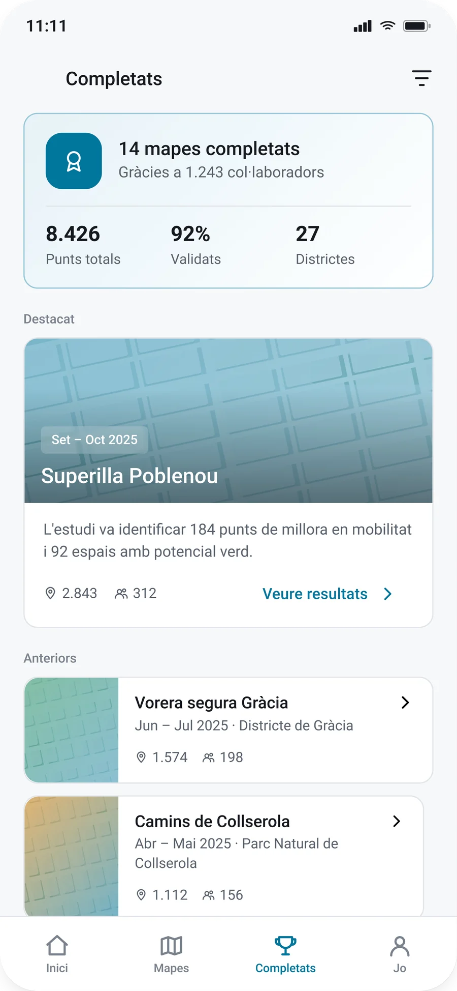
The history: how many maps are done and how many people helped, one featured result and the earlier maps.
El historial: cuántos mapas se han completado y cuánta gente ayudó, un resultado destacado y los mapas anteriores.
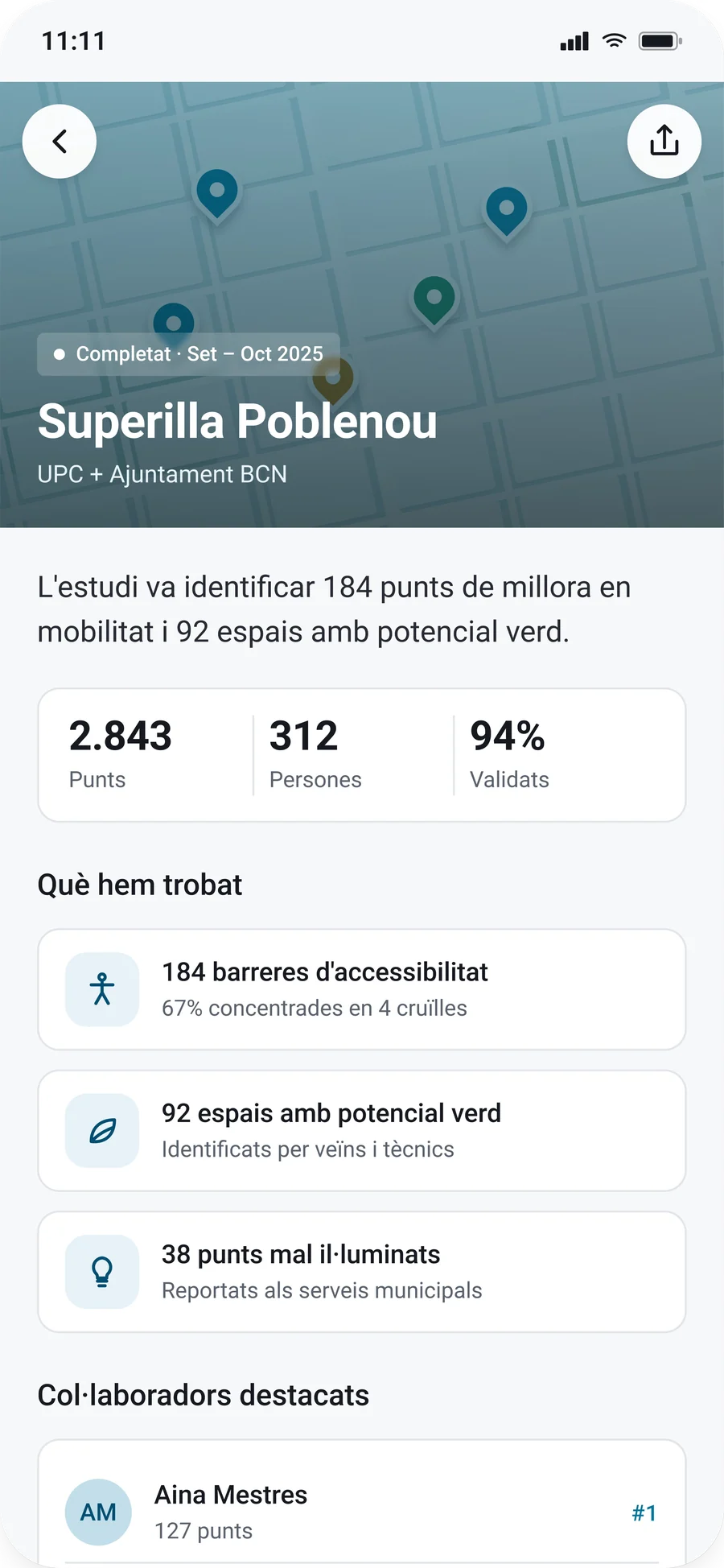
Result
Resultado
A finished map in numbers: points, people, the share validated, what was found and who contributed most.
Un mapa terminado en cifras: puntos, personas, el porcentaje validado, qué se encontró y quién colaboró más.
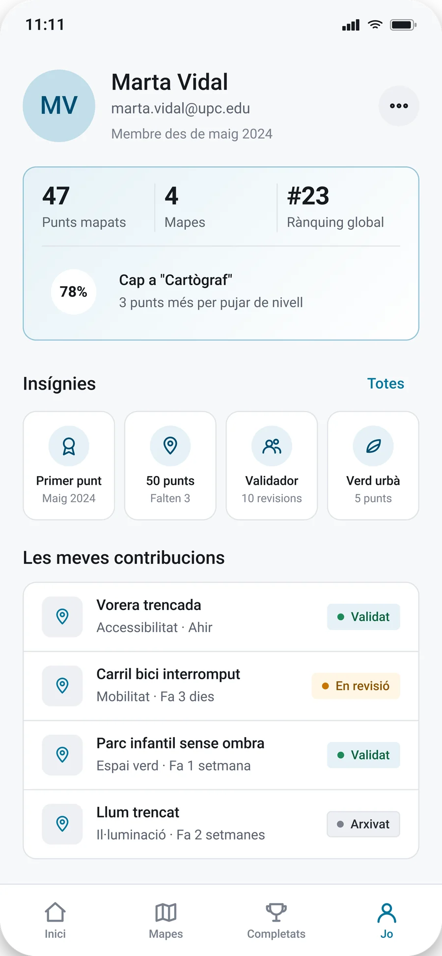
Profile
Perfil
Your level and ranking, your badges and your contributions with their status, where the rewards system comes together.
Tu nivel y tu ranking, tus insignias y tus contribuciones con su estado: el lugar donde se junta el sistema de recompensas.
05
Try it
Pruébalo
This is a working rebuild of the app, not a video. Open a map, drag it, tap a pin, add a point and look at the results of a finished map.
Es una reconstrucción funcional de la app, no un vídeo. Abre un mapa, arrástralo, toca un pin, añade un punto y mira los resultados de un mapa terminado.
Things to try
Qué puedes probar
On Home, open a map. Drag it, tap a pin for its details and use the layers button to show or hide categories.
Tap the map to move your marker, then use the big button to add a point. The address follows the marker.
Choose a category and a severity, add a note or a photo from your device and send it. A photo stays on your device. Your point shows up on the map and your counters go up.
In Completed, sort the list, open a result and look at the final map.
In Profile, open the map language row to switch the whole app between Catalan, Spanish and English. Spanish and English change this page too.
En Inicio, abre un mapa. Arrástralo, toca un pin para ver sus detalles y usa el botón de capas para mostrar u ocultar categorías.
Toca el mapa para mover tu marcador y usa el botón grande para añadir un punto. La dirección sigue al marcador.
Elige una categoría y una gravedad, añade una nota o una foto de tu dispositivo y envíalo. Una foto se queda en tu dispositivo. Tu punto aparece en el mapa y tus contadores suben.
En Completados, ordena la lista, abre un resultado y mira el mapa final.
En Perfil, abre la fila del idioma del mapa para cambiar toda la app entre catalán, español e inglés. Español e inglés cambian también esta página.
App languageIdioma de la app
Sample data only. Nothing is saved or sent.
Solo datos de ejemplo. No se guarda ni se envía nada.
The prototype rebuilds the app from the Figma design: splash, home, active maps, map, add a point, completed, result and profile.
The notifications, layers, sort, language and about sheets, the pin details and the search are not in the design. I added them so every button leads somewhere. The map language row switches the whole app between Catalan, Spanish and English, which goes beyond the single language in the design.
I also added behaviour the static design did not show: a map you can drag, a marker you can move, adding a point (its button label is mine, as the design cuts off before it), counters that go up and a final map for finished results.
The street map is a drawn pattern, not real map data. Pins beyond the ones in the design, the other maps’ details, the notifications and the pin descriptions are my own sample content.
I had the wording of the Home activity feed and of the data conclusions but not how they look, so I composed their layout and kept the text.
Everything is sample data, with the names and numbers from the design. The colours, type sizes, radii and spacing in the design system section were taken from the final screens. The names and roles are my description of how the app uses them. The sample text is in Catalan, as in the screens, and some of it mentions UPC, as the design does.
El prototipo reconstruye la app a partir del diseño de Figma: bienvenida, inicio, mapas activos, mapa, añadir un punto, completados, resultado y perfil.
Las hojas de notificaciones, capas, orden, idioma y «sobre», los detalles de los pines y el buscador no están en el diseño. Los añadí para que cada botón lleve a algún sitio. La fila del idioma del mapa cambia toda la app entre catalán, español e inglés, algo que va más allá del único idioma del diseño.
También añadí comportamiento que el diseño estático no mostraba: un mapa que se arrastra, un marcador que se mueve, añadir un punto (el texto de su botón es mío, porque el diseño se corta antes), contadores que suben y un mapa final para los resultados terminados.
El mapa de calles es un patrón dibujado, no datos de mapa reales. Los pines que no están en el diseño, los detalles de los otros mapas, las notificaciones y las descripciones de los pines son contenido de ejemplo mío.
Tenía las palabras de la actividad reciente de Inicio y de las conclusiones de datos, pero no cómo se ven, así que compuse su maquetación y mantuve el texto.
Todo son datos de ejemplo, con los nombres y las cifras del diseño. Los colores, tamaños de letra, radios y espaciados de la sección de sistema de diseño se tomaron de las pantallas finales. Los nombres y los roles son mi descripción de cómo los usa la app. Los textos de ejemplo están en catalán, como en las pantallas, y algunos mencionan la UPC, igual que el diseño.
Next steps
Próximos pasos
Replace the drawn street map with real map tiles and address search.
Test adding a point outdoors on a real phone, with the camera instead of a file picker.
Raise the contrast of the category chips: their text is 4.2 to 4.4:1, just under 4.5:1.
Make the prototype remember the points you add between visits.
Sustituir el mapa de calles dibujado por mapas reales y búsqueda de direcciones.
Probar el alta de un punto en la calle con un móvil real, con la cámara en lugar de un selector de archivos.
Subir el contraste de las etiquetas de categoría: su texto está entre 4,2 y 4,4:1, justo por debajo de 4,5:1.
Hacer que el prototipo recuerde entre visitas los puntos que añades.